FRONT-END DEVELOPER
RESEARCHER
Deliverable: a functional café web page to inform and attract customers
IN THE BEGINNING...
...of a cozy San Diego winter, three classmates and I ventured to create a website.
After searching and emailing for clients, the manager of Audrey's met with us at the end of January and we began the process of creating the never-before seen Dr. Seuss themed coffee website to accompany a novel coffee shop. Anyone who has read or seen a Dr. Seuss composition can say that its theme is poles apart from the average Instagram picture. Our team decided to take on the challenge of inserting the whimsical, quirky and unconventional into a technological era of modernity, aesthetic, and convention.
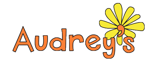
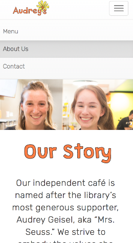
Audrey's Café was named after Audrey Geisel, also known as Mrs. Seuss. The library in which it is located was dedicated to Theodore Geisel, the author and creator of Dr. Seuss.
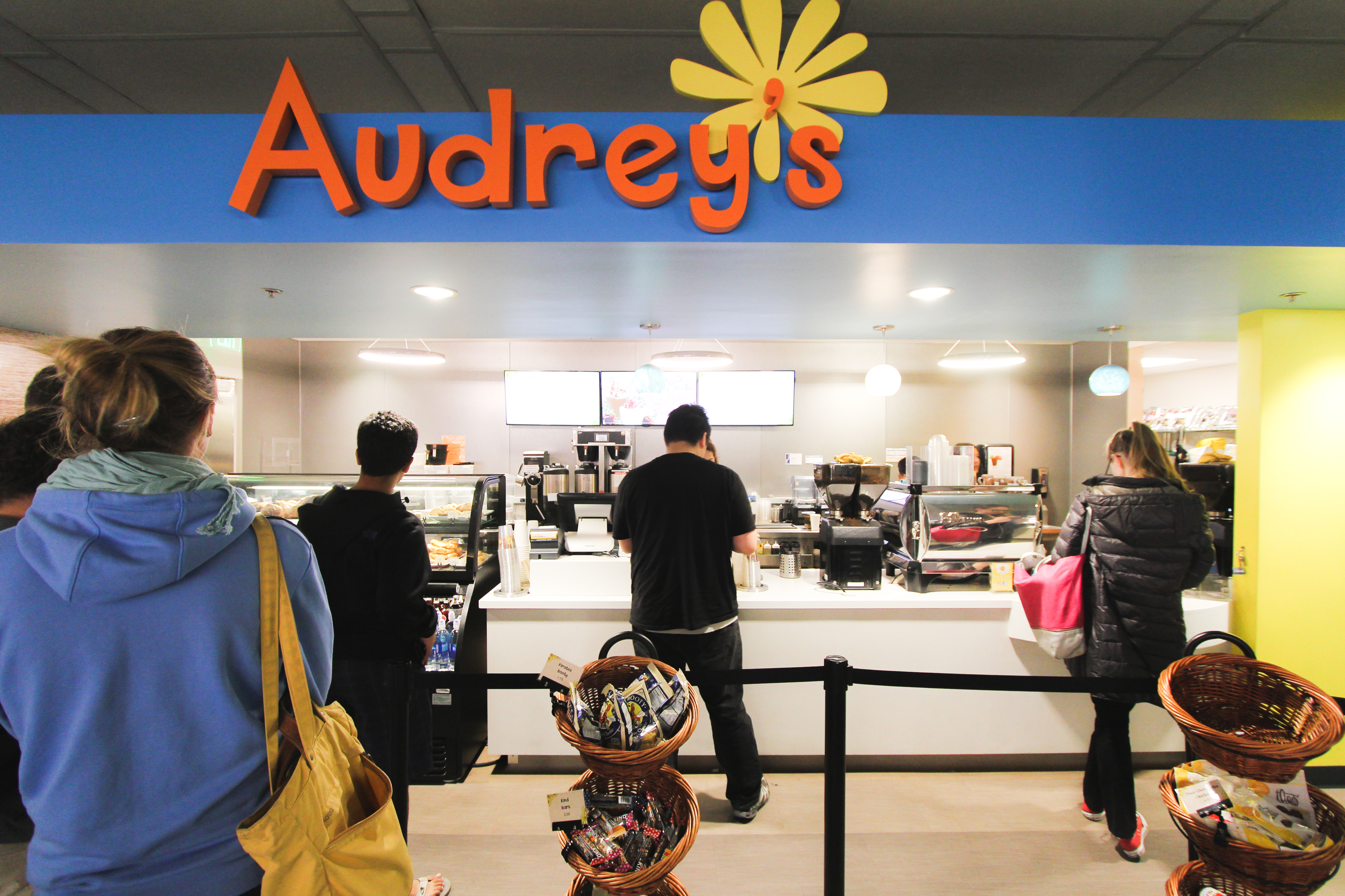
The current Audrey's page was embedded in the UCSD website but not even listed in the main navigation. The site adopted the scholarly format of a college informational page, limiting its brand to no more than a splash of orange and yellow in the title.
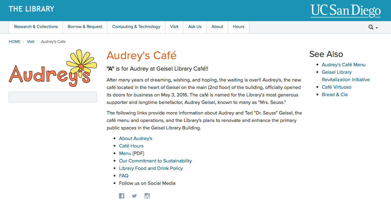
Audrey's site within UCSD's
Using extensive interviews with both the client and users, we found a list of needs:
For the Client
- Establish unique personality, brand and its goal to be student-centered
- Have a larger internet presence
- Practically show hours, location, deals and the menu
- Means for users to provide feedback
For the User
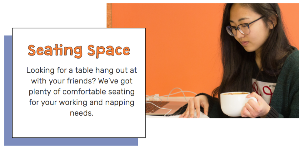
- Photos of seating space, drinks and general atmosphere
- Convenient and accessible hours and menu
- Available deals, promotions and featured drinks
- Address the needs of specific personas
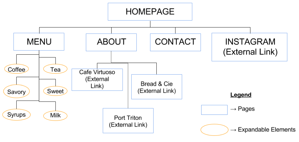
SITE ARCHITECTURE
Using the information we gathered, we quickly mapped out the structure and potential content, making sure to keep our target audience's goals in mind.
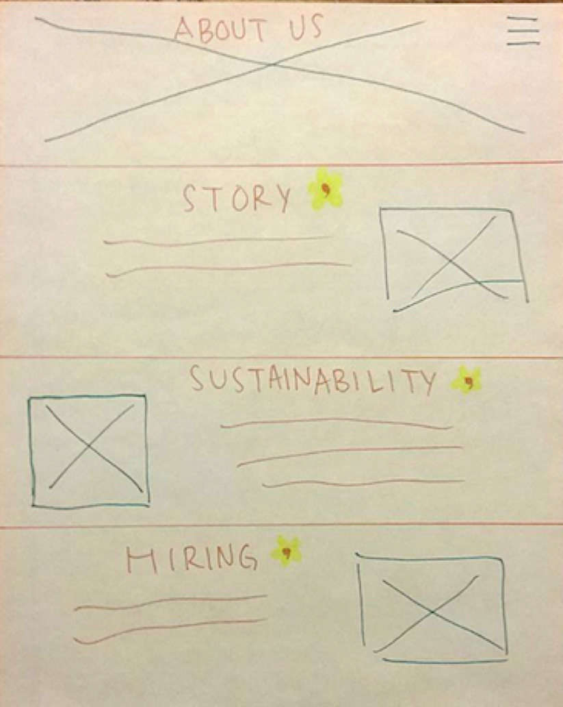
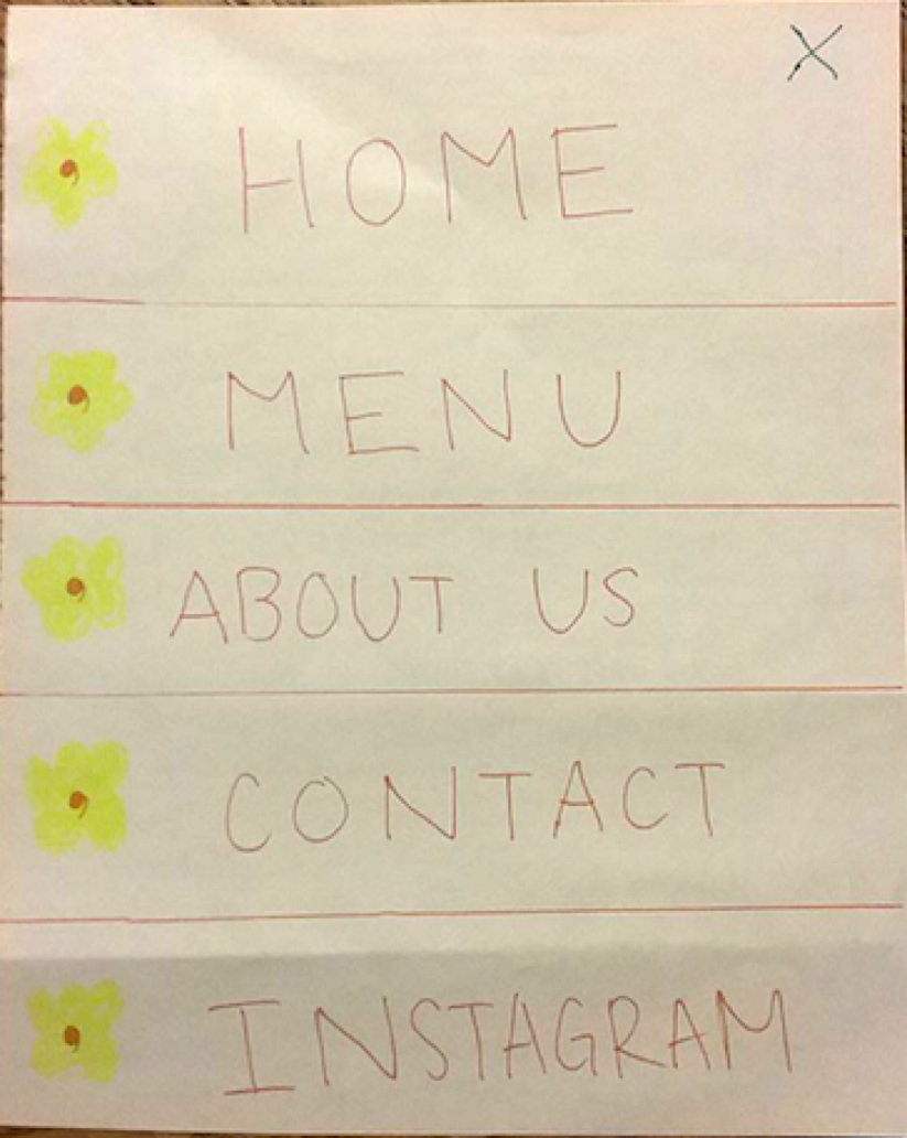
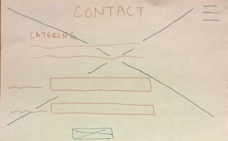
PAPER PROTOTYPING
After summarizing our interviews into a concise list of needs, we drew many paper prototypes, condensing them down to a few chosen designs.
ADDRESSING CLIENT AND USER NEEDS
Coffee Supreme color splash example
During our competitive analysis of other coffee websites, like Coffee Supreme, we saw a trend of subliminal hints of a brand's color. We applied this concept by putting washes of Audrey's bold yellow and orange in our pictures in order to complement the café's walls and furniture. To kill two birds with one stone, we presented the seating area and ambiance for the users' needs while frankly exhibiting the distinctive brand for our client. Because Dr. Seuss is a central theme to both the café and the library, we incorporated this into each page by adding lively pastel colors to surround our text boxes while pointing viewers to its main selling points.
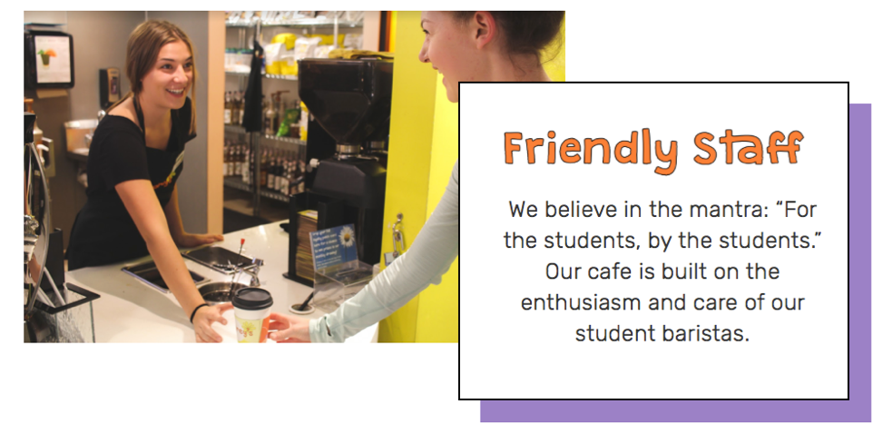
As an on-campus coffee shop, we highlighted the mantra "for the students and by the students" through our pictures of the staff and in our choice to add a contact page. Users can empathize with the pictures of students working and studying, and identify themselves in the motto. To attract the students and users it serves, the contact page makes Audrey's approachable and feedback quick.
Content design examples
With these ways to address the needs, we translated the paper prototypes into low-fidelity mockups of both desktop and mobile.
FINAL PRODUCT
We coded our final product from scratch using Bootstrap, HTML and CSS. Take a look at this funky website!
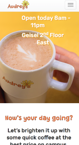
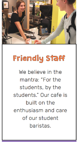
3 examples of the mobile site
For both the user and client, a quick glance at the header image would give all the necessary information needed to visit the location. In addition, the first suggestion of the site is to look at the menu, answering the essential question: "What do I want to drink?".
To add solidarity between the website and the café, we chose the fonts Rubik and Karla which match the playful brand of Audrey's and the shop's own logo font: This Font is Bold.
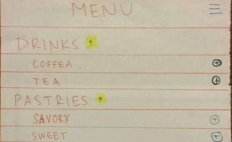
MOBILE MENU DESIGN
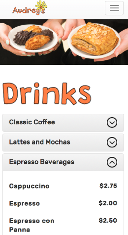
While designing mobile first, we took a look at many competitors' styles for menus. Some had downloadable PDF menus and some (like Better Buzz) had an unceasing list on a webpage. However, to cater to the students rushing to class and for mobile convenience, we wanted to avoid downloading or scrolling past every single item. A condensed and expandable menu fit perfectly, allowing the user to go straight to the section desired, shortening searches and removing download time.
REFLECTIONS
As the first project undertaken for a client professionally, this experience taught me much about working with specifications and being user-centered. The critique we received from presenting our need finding results, competitive analyses, and product to our professor was some of the best feedback and greatly improved my design theory. I learned how to unearth and create personas, and evaluate heuristics more in depth. Before this project, I barely scratched the surface front-end coding. Diving in head first, I became one of the main developers in this project. The most impactful fruit of this was enhancing my coding abilities in both HTML and CSS. I thoroughly enjoyed the process of working with my partners to make my first functioning website, and I endeavor to continue improving in future web development projects.
BACK TO PROJECTS TOP