UX DESIGNER
FRONT-END DEVELOPER
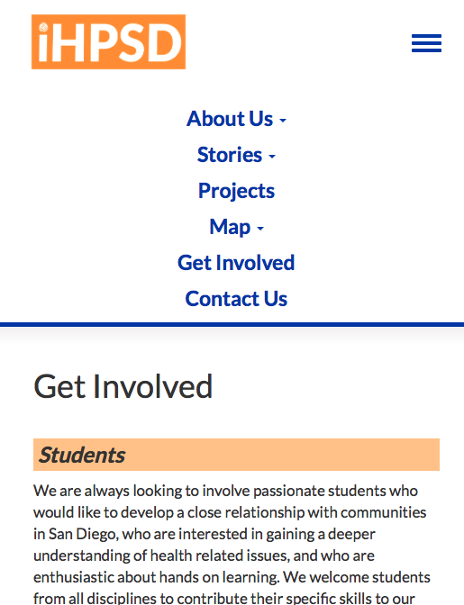
Deliverable: a website that features articles written by an organization to encourage students to get involved in the community
DESIGN FOR DEVELOPMENT
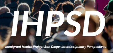
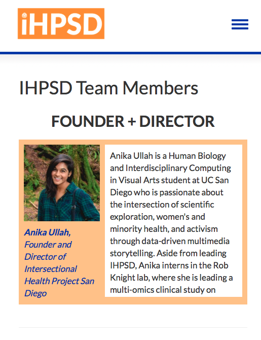
For my engineering course, seven classmates and I partnered with a nonprofit UCSD organization to provide a platform to showcase multimedia stories about health issues affecting immigrant communities. The goal of the site is to connect UCSD students to these issues in hopes of increasing community involvement among student volunteers.
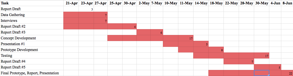
We constructed a Gantt to organize a concise plan for development. Some tasks included data gathering, concept development, prototyping, and testing.
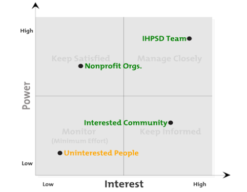
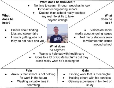
In order to keep the goals clear for both our client and the community, we created a stakeholder matrix and a user profile.
SITE ARCHITECTURE | PROTOTYPES
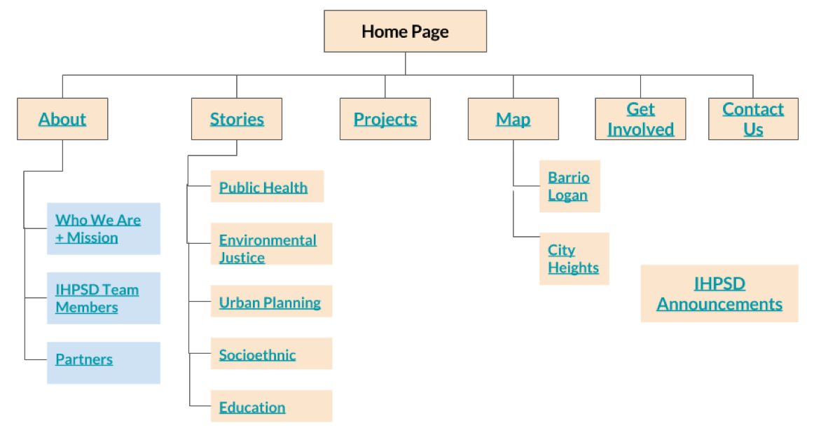
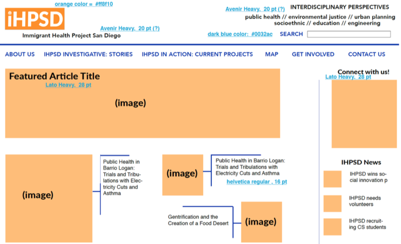
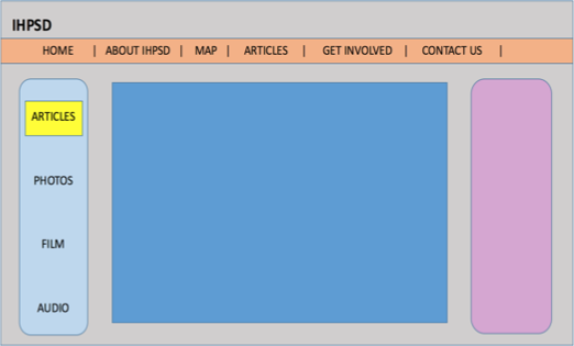
Basing our paper prototypes on the architecture our client gave us, we drew up different ideas for an article page and the home page.
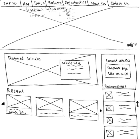
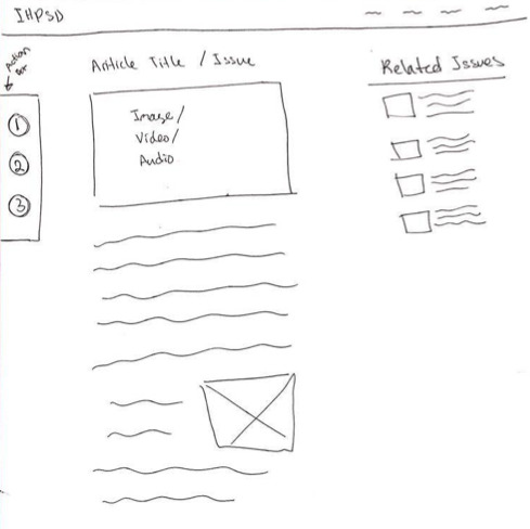
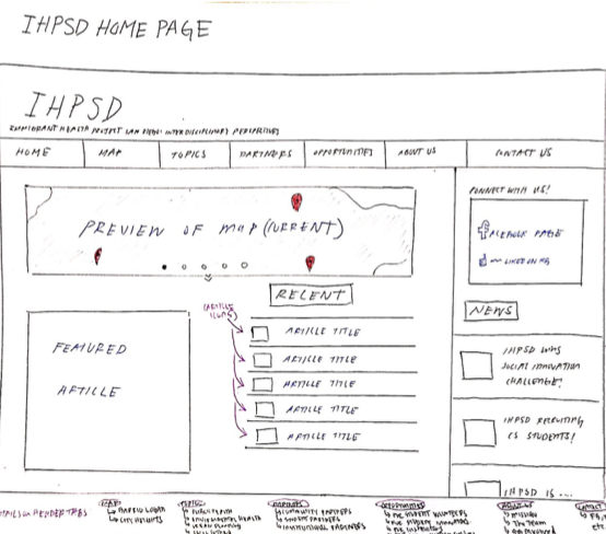
Our client desired each page to have specific functions, such as an action bar with options for getting connected. While drawing up prototypes, we ideated amongst the group on how to display those functions both on the home page and on the article page.
After prototyping through paper and pencil, we made higher fidelity mockups, keeping the design simple and modern. For secondary navigation, we added breadcrumbs as a visual tool to give insight to the site's hierarchy and the user's location at that point in time.
FINAL PRODUCT | USER TESTING
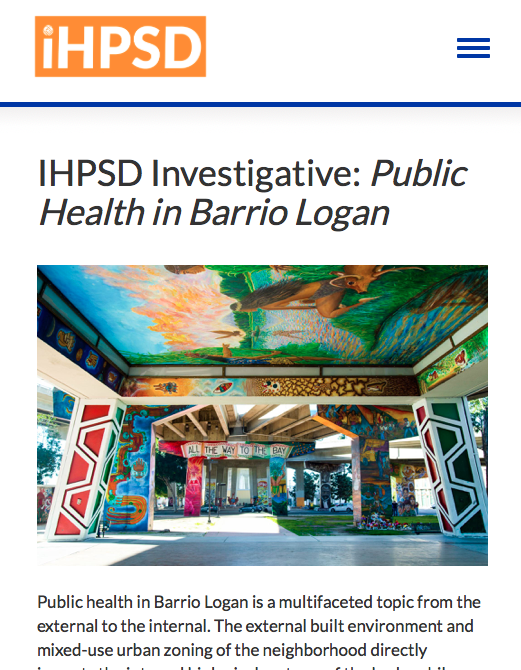
Using Git Version Control, our team coded this website mobile-first using HTML, CSS and JavaScript. With a bootstrap framework, we speedily made the product ready for user testing. Take a look here!
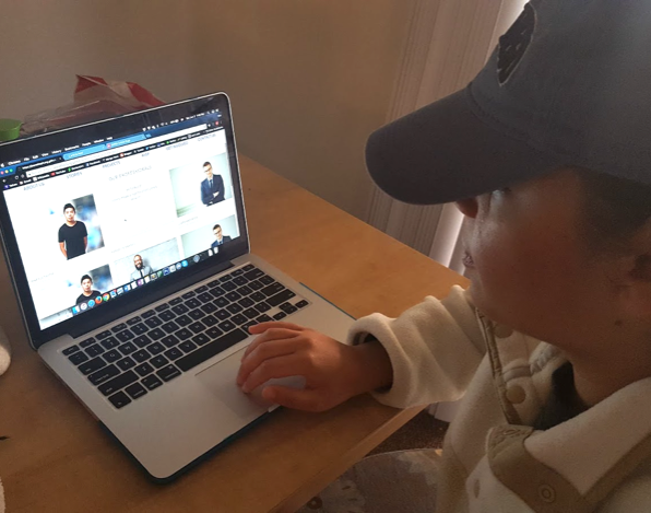
Each of the members of our group interviewed several people for usability, content, and overall design. We found that most people thought it was an informational website about a volunteer organization or environmental racism, and that it was easy to navigate.
IMPROVEMENTS

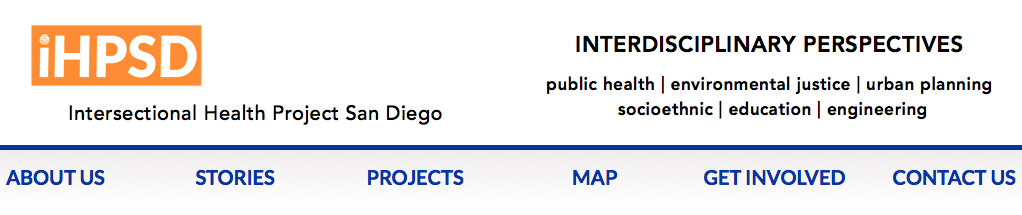
From the feedback received, we gathered that the organization's goals are hard to comprehend at first glance. It was even difficult for us as a team to understand what our client wanted until further explanation. The complex content needed to be displayed in a manageable fashion, so we used symbols to categorize article topics. We also placed the important topics on the header so that users would immediately see what aspects the organization covers.
REFLECTIONS
These were the busiest nine weeks of production and the largest group I've worked with in my college career. However, with the organized way we approached the problem for our client, I consider our teamwork swift and efficient, with minimum hiccups. We were able to deliver a finished product in a timely manner, along with a user manual for content management. In the future, I hope to continue lending a hand until the organization can self-sufficiently update their content. Thanks for reading!
BACK TO PROJECTS TOP